Christ Seed Book Cover Design Ideas – Please Help
Thanks for taking the time to look at this and to help me out. The above image is a design idea for the cover of the book called “Christ Seed Explained” which I have recently finished writing. I’m trying to move towards completion of a book cover, and I’d like your help. I’d like to hear your opinion. Specifically, I’d like you to contemplate and answer these four questions.
- If this were a book cover on a book on a shelf in a bookstore, would you want to buy this book? How does this cover make you feel? Would you want to know more about this book?
- What do you see? Please take your time to contemplate what you see and what comes to mind for you. Do not scroll down. Most people will notice more than one element. What are they for you? What do these symbols represent to you?
- What’s your impression of the color scheme?
- Any other thoughts or feelings?
I would appreciate if you will comment below or write to me to let me know your thoughts. After you’ve had some time to contemplate what you see, there are other design ideas and explanations from me below.
Do not scroll down yet.
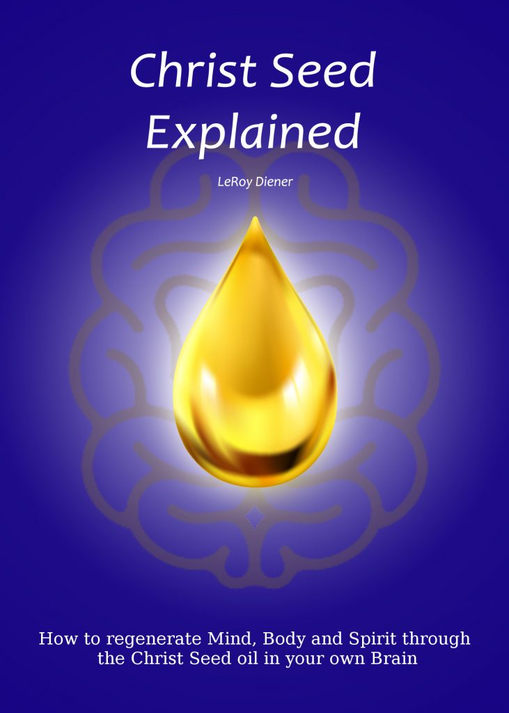
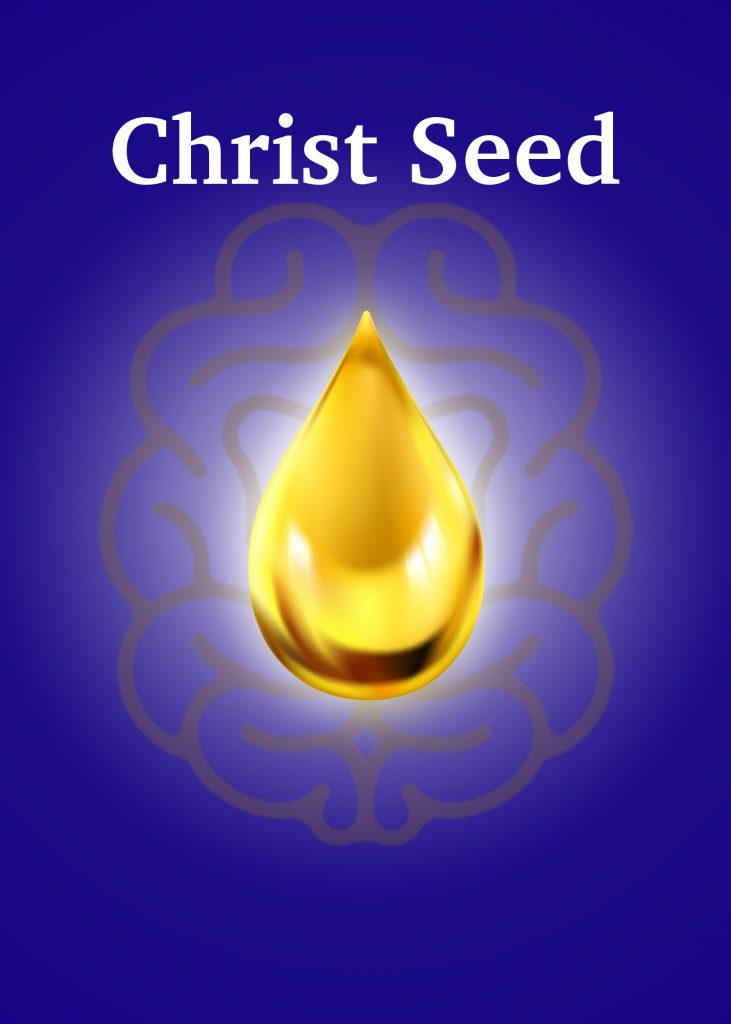
I’ll tell you now what the symbols represent to me. Don’t read this paragraph until you’ve had a chance to absorb and contemplate on your own. The tear-drop shaped symbol in the middle represents a drop of oil, which is the Christ Seed oil. The curvy lines behind the oil drop represent a brain.
The above image came after some variations. Here’s the initial image, created by my friend, Heidi.
Here are some of my thoughts about Heidi’s wonderful creation. I love the overall color scheme, the dark blue background, the golden color of the central drop, the glow around the drop, the white lettering. I am enamoured with the golden drop. I’ve heard comments from a few people about what they see in this drop. It’s a lot. I feel torn about the artistic rendition of the brain. To me, the convolutions are too wide to convey the idea to me that it’s supposed to be a brain. Maybe I’m just too literal. The prominence of those curvy lines without a clear meaning to me at first caused me to feel a little confused and distracted from the beauty of the rest of the image. On the other hand, I notice the careful placement and how the lines of the brain seem to cradle the drop. I don’t want to lose that.
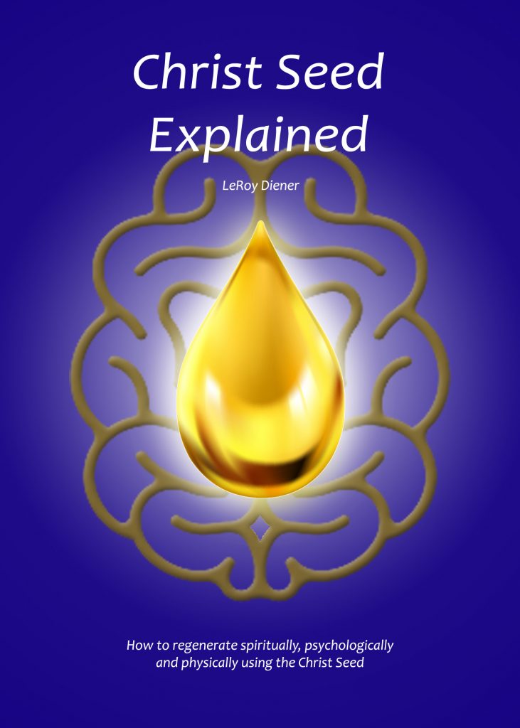
This next image is the same as the above, but without the brain.
In my mind, this above image offers simplicity and highlights the phenomenal beauty of the drop. I have to admit, though, that it’s missing a component that could add to it. And, it might even be too stark.
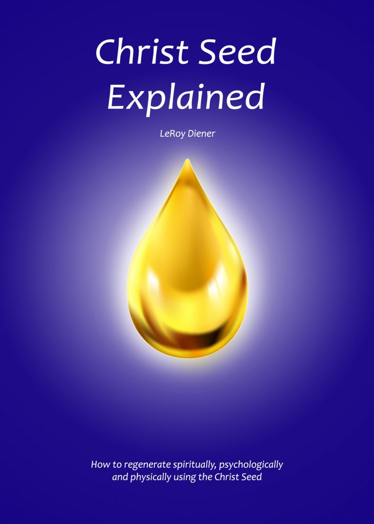
The next three images are the same as the above images, with a couple changes. An important change is the opacity of the brain. In the original, the opacity is 100%. In the above image, the opacity is 0%. In the three images below, left to right, the opacities are 30%, 20% and 10%.

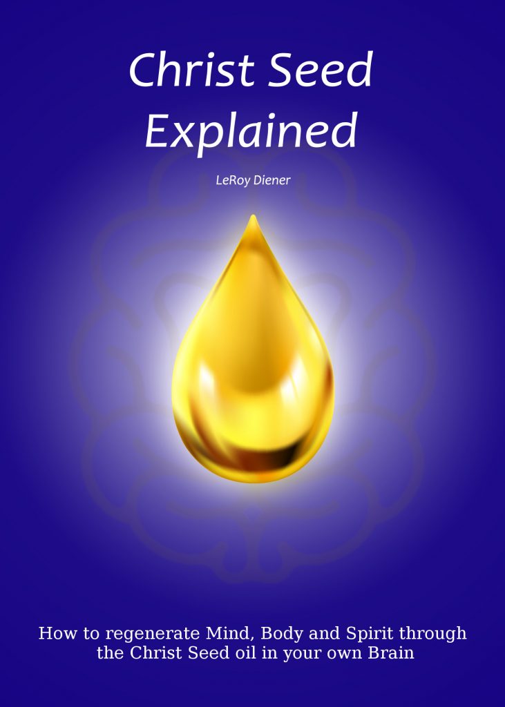
Another change to these three images from the original is the subtitle. I changed the text to be more informative. I also made the font size larger, so that it’s easier to read. In addition to the four questions above, here’s question #5: What do you think or feel about the two variations of the subtitle? wording? font-size?
Back to the important point about the opacity of the brain. Here’s question #6: How does the opacity of the brain affect your perception of the cover? Which is your favorite? Other related thoughts?
Here are some of my thoughts. I love the central drop so much that I don’t want too much distraction. An ideal for me is a cover where the following happens for you. You don’t notice the brain at first. You see the beauty of the drop at first, but you get a sense that there’s something more there. As you go into it, you notice the lines of the brain. Noticing a pattern, the lines become less faint to you, and you can see the full pattern. Maybe you get an idea that this pattern represents a brain. Certainly, the shape does not overwhelm you at first.
OK, maybe my ideas are crazy. I will note, though, something interesting. Even though I typically think of myself as someone who is analytic and not interested in aesthetics, I’m really enjoying this creative process.
On a technical note, in case you noticed that the first of the three images above, the image with 30% opacity is the same as the first image in this blog post, kudos. It is the same image.
On a marketing note, I’ve heard that an effective book cover draws people in right from the first glance, so that they become curious and want to know more. This leads me to question #7: Do you feel an attraction when you look at this cover? Curiosity?
As I mentioned, I’ve been having fun playing around with these designs, showing them to friends and talking about them. One friend noticed the phenomenal beauty of the oil drop and suggested that it would make a nice T-shirt. So I came up with the below image as a tee shirt design
Question #8: Your thoughts about the T-shirt design?
Here are some closing thoughts. Below are links to articles on my website which I’ve written on the topic of the Christ Seed. They give a great intro into the topic. I feel excited to get this book out there. I think that many people can benefit from the info. I am not aware of anything else availalbe with this info curated and organized in a sensible way. I have not yet started advertizing the existence of the book. I’ve been waiting to have a good book cover as a crucial component to advertizing. As soon as I have a good cover, I should be good to get started. I am grateful for any help from you to getting there.
I appreciate very much you taking the time to help me with this. I look forward to your answers to my 8 questions, especially the first two.
Thanks For Reading!
Hi Leroy,
So glad I clicked on this link! I have never heard of the Christ Oil and I am very interested.
As an artist myself, here are some thoughts on the book cover:
The colors are just what I would have chosen.
When I looked through the various iterations the ones I liked best are where the ‘brain’ is either at only 10% or the opposite.
I kept feeling the design needed something more … what came is a very fine lined flower of life filling the whole background at maybe 40/50% opacity.
Look forward to reading the book!
Mahara
Thanks LeRoy for all your efforts with this. The cover design definitely is a critical aspect of the success of your publishing your book. People still judge a book by it’s cover since we are still identified with the 5 sensory beings that we are.
1) Personally, for me to pick up a book, I’d need to be interested in the subject. I rarely just browse to find some book anymore like I used to.
Once interested in this subject however, this book cover definitely catches my attention.
2) I definitely notice the central theme of the seed. At first it appears to be a drop of golden oil, but that still serves as a focal point of interest. I also notice the “brain” scrollwork, but I don’t identify it as such. If it were to represent a brain, the outer edges would have to be closer to uniformity, not so bumpy. When you observe a brain, you notice the convolutions, but the overall outer surface is smoother.
3) I like the color scheme, it works well and offers a warm feeling. Nice contrast between the seed and the background, giving emphasis on the seed.
4) No other thoughts here.
5) I like the wording and font size of the modified version in the first picture. It definitely reads better in the larger font. The author’s name and size do not distract, yet are legible for the curious.
6) I agree with the chosen first image regarding brain opacity. In Heidi’s version, there is too much contrast, so it conflicts with the seed/drop. One needs to be dominant. Your choice of making it opaque is a good one. Again, I like the opacity of the initial presentation. This works best.
7) The idea of a drop/seed is definitely something that appeals to me. Again, the brain would “read” more as a brain were the outer edges not so deeply convoluted. The rest of the lines within should be left as they are however, since the cradling effect that you mention works well in symbolism. I would just smooth out the outer lines.